
Case study · Agency years
Fantasy Interactive
What if booking a flight were the best part of the trip?
According to J.D. Power, 87% of travelers used the Internet for the bulk of their travel planning in 2012, yet the airline booking experience was stuck in the 90s. Fi's answer was a creative exploration: what would an airline website look like if it were intelligent, aware and suggestive? Chris Rubin conceived it, then wrote and produced it, as the swan song of his tenure at Fi.
- Client
- Fantasy Interactive (self-initiated)
- Sector
- Travel, airlines
- Work
- The Future of Airline Websites: a creative exploration in online travel booking
- Role
- Conceived, written and produced by Chris Rubin at Fantasy Interactive
The brief
The CEO provided a budget and a directive: produce a creative exploration that would attract potential new clients in the travel industry. I conceived the project from there.
Fi reviewed every major airline website and graded them on information architecture, interaction design, messaging and visual design. The results were disheartening. Unless the airlines took drastic measures, third-party sites like Kayak and Expedia would keep eating into their profits. So we asked, what if?
What we built
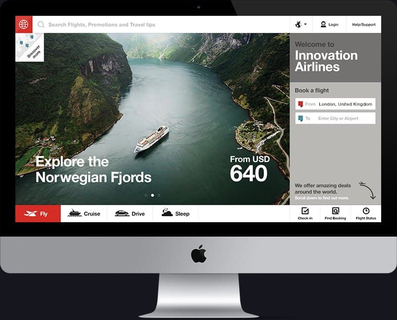
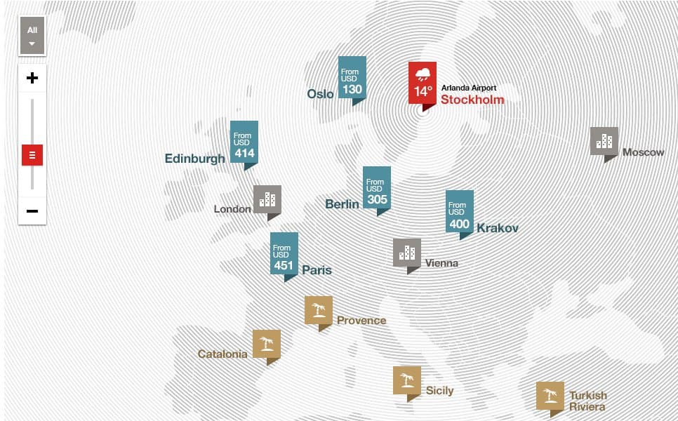
What if an airline website played travel agent? Intelligent: it knows where you are, so it offers options that save steps. Aware: deals happen, so it shows the best prices in real time for your location and preferences. Suggestive: you arrive with an intention, and along the way it invites you to consider a place you hadn't.
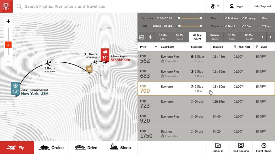
What if utility were beautiful and timely? Round trips as the default, a convenient calendar, passengers added in a tap, and when delays threaten a connection, fast, clean flight information at exactly the right moment. Social trips shared by other travelers, hotel partnerships, city guides, and a page curl that animates into a map.
I functioned as writer, editor and producer, and the project was mine from the first idea. It was a project close to my heart.
The exploration.
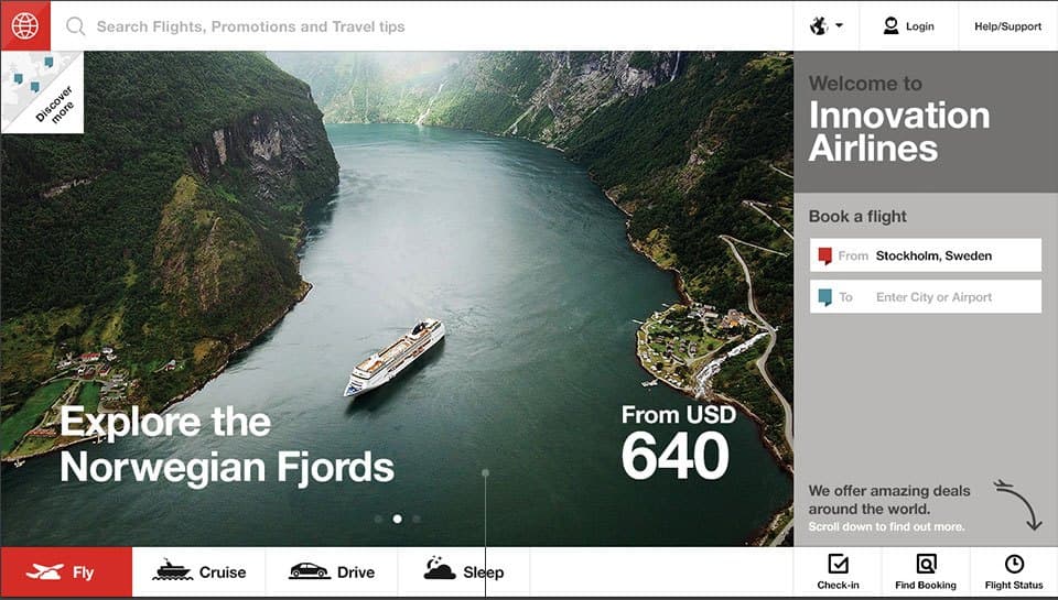
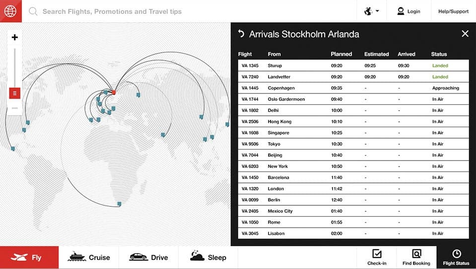
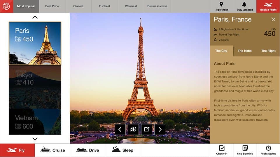
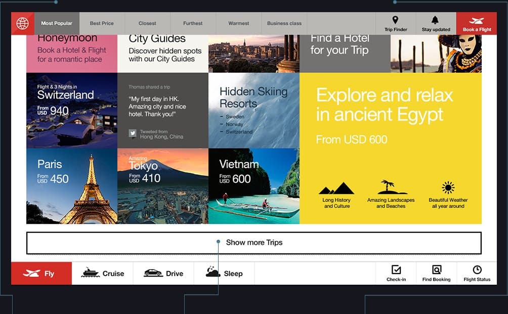
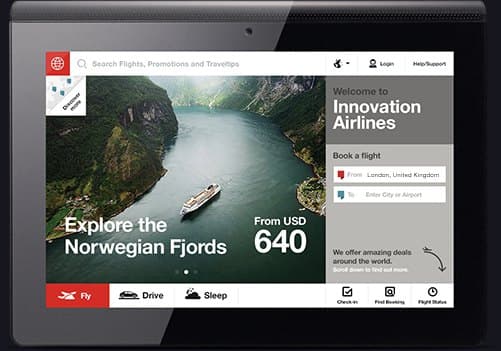
From the case study: the home page, explore, the deals map, available flights, multi-city routing, airport status, the trip page, tablet.

Scroll →
The work, in motion.
The concept film, narrated. Sound on.
What changed
Within ten days of launch, the CEOs and CMOs of three major airlines were booking appointments in our San Francisco office. Site of the Day followed.
A demonstration, aimed at an industry, that the booking experience could be the brand experience, and a calling card for the agency in the travel market.
Is your best story still living in one head?
Book the Diagnostic